React has completely revolutionized the approach to front-end development. Facebook (now, Meta) built this popular JavaScript-based framework. It allows you to successfully create user interfaces, websites, desktop and mobile apps, and PWAs. All you need to do is find the right React development company to guide you through your projects.
As the usage of smartphones increases around the world, the demand for mobile-first designs has also increased. During web development, it is prioritized to create apps that perform well on various devices, like smartphones, and desktops. Giving users an enhanced experience is the reason behind the creation of such responsive apps.
There are many tools and libraries available in the market that can help you build such websites, but none can compete against react-responsive. This blog discusses how you can leverage it to build and test a responsive website.
1. What is React-Responsive?
React-responsive is an NPM package that allows the developers to implement different styles to the react components based on the screen sizes. This helps in creating responsive designs for React projects that can adjust to various screen sizes automatically.
The DOM elements that developers show and hide are defined by react-responsive using both breakpoints and media queries. This library helps maintain the structural integrity of the web designs while they adapt or scale as per varying screen sizes.
In other words, it’s a web design approach that ensures your website performs well on any device it’s viewed on.
4. React Responsive
— Chris Staudinger (@ChrisStaud) July 24, 2022
All web applications you build should be responsive.
You can write CSS media queries for your React apps if you want.
There is a much cleaner and more effective solution though. React Responsive ✨
👉 https://t.co/unMx85Pd00 pic.twitter.com/hWkX0zSvt8
2. Why Focus on Responsiveness?
When you have a larger audience with varied interests and preferences, they might be using different devices with varied screen sizes to access your website. So, your website design must be compatible with multiple devices and screen sizes.
To ensure that, developers leverage responsiveness to render web pages for different types of devices and screen sizes. The important aspects of a responsive design include:
2.1 Flexible Layouts
A web layout capable of adapting to various screen sizes is called a responsive layout. It allows your web page to look good on various devices with different screen sizes and resolutions such as phones, tablets, laptops, and computers. This also eliminates the need to design separate websites.
2.2 Media Queries
Different devices and screen sizes require different styles. But how do you define them in design elements? Well, that’s where Media queries come in. It’s a CSS3 feature that helps you specify various types of styles. It enables you to create responsive web pages using different CSS rules for different devices.
2.3 Flexible Images and Media
Having a responsive design isn’t enough. Your media on web pages must also be flexible. So that when you add them to the page, they can easily adapt to fit the screen sizes.
2.4 Responsive Typography
Fonts play a crucial role in making your content look good across all devices. Some fonts are better for small screens, whereas others are for large screens. Here, you can leverage the responsive typography technique to use different font sizes for different devices and screen sizes.
2.5 Good Navigation
Web navigation is most important for offering an enhanced user experience. That is why navigation should be easy across all devices. So when you are designing a responsive website, you have to ensure that you have a clear and easy-to-use navigation in place.
If you are someone who intends to launch their website on multiple platforms and devices, then creating a responsive design is a must. Leverage responsive layouts and typography, media queries, flexible images and media, and good navigation to design an elegant site that performs well and is easy to use across all devices.
3. Responsive Websites with React-Responsive
React-Responsive library help you create a responsive web design as it allows you to wrap the existing React components and implement styles suitable for screen sizes in various ways.
Using this npm package eliminates the need for manually writing @media rules in the CSS. In short, it enables you to build responsive designs effortlessly. Install the react-responsive library using npm.
npm install --save react-responsive |
After the installation, you can import the React library to the React component. We can do it in two ways, usage with hooks or usage with components
3.1 Usage with Hooks
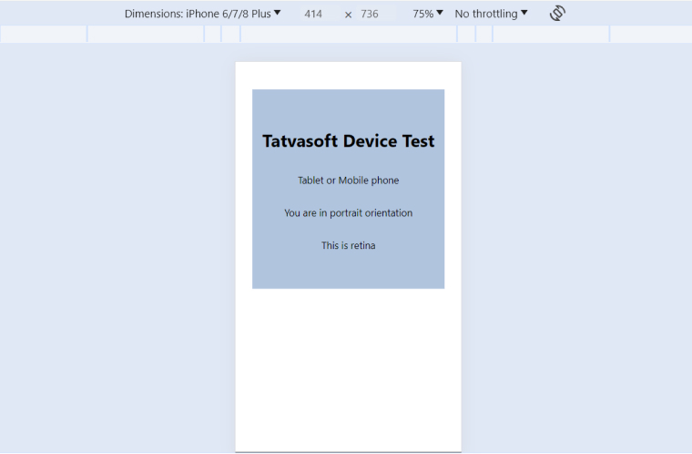
The useMediaQuery hook is used to check screen size and orientation of the device which returns a boolean value which indicates whether the current screen matches the specified media query or not and based on that we can identify our screen size and resolution.
Below code is to display different messages based on the result of the media query checks.
import { useMediaQuery } from "react-responsive"; const UsageWithHooks = () => { const isDesktopOrLaptop = useMediaQuery({ query: "(min-width: 1224px)", }); const isBigScreen = useMediaQuery({ query: "(min-width: 1824px)" }); const isTabletOrMobile = useMediaQuery({ query: "(max-width: 1224px)" }); const isPortrait = useMediaQuery({ query: "(orientation: portrait)" }); const isRetina = useMediaQuery({ query: "(min-resolution: 2dppx)" }); return ( <div className="react-responsive"> <div className="react-responsive-content"> <h1>Tatvasoft Device Test</h1> {isDesktopOrLaptop && <p>This is a desktop or laptop</p>} {isBigScreen && <p>This is a huge screen</p>} {isTabletOrMobile && <p>Tablet or Mobile phone</p>} <p>You are in {isPortrait ? "portrait" : "landscape"} orientation</p> {isRetina && <p>This is retina</p>} </div> </div> ); }; export default UsageWithHooks; |
3.2 Usage with Components
The MediaQuery component is used to render content conditionally based on media query matches with current device resolution. We can wrap components or elements with this component and specify the conditions for rendering by specifying props such as minWidth, maxWidth, minHeight,maxHeight, Orientation, query, etc.
import MediaQuery from "react-responsive"; const UsageWithComponent = () => ( <div className="react-responsive"> <div className="react-responsive-content"> <h1>Tatvasoft Device Test</h1> <MediaQuery minWidth={1224}> <p>This is a desktop or laptop</p> <MediaQuery minWidth={1824}> <p>This is a huge screen</p> </MediaQuery> </MediaQuery> <MediaQuery maxWidth={1224} minWidth={768}> <p>This is a tablet</p> </MediaQuery> <MediaQuery maxWidth={767}> <p>This is a mobile</p> </MediaQuery> </div> </div> ); export default UsageWithComponent; |
4. Advantages of React-Responsive
Using a react-responsive library with ReactJS for web development offers a large array of benefits including:
- Simplified Code: While using this npm package, you don’t have to manually write the complicated @media rules in your CSS. You can just directly apply responsive styles in your React components. It results in a maintainable and readable code.
- Consistency: To ensure the consistency of your responsive designs throughout all screen sizes, React Responsive proves to be useful. You have to write code only once and it works on every screen size or device. This saves your time as well as minimizes the risks of errors.
- Reusability: The library provides reusable components for web development. It helps you create more flexible and modular designs without having to duplicate your code.
- Community Support: React-Responsive is a popular library in the React community. So, you can easily get support or help for library-related issues or questions.
The process of developing responsive layouts is streamlined and simplified with the effective use of a react-responsive library. It also enables you to customize the look of your website or application for various devices and screen sizes.
5. Testing React-Responsive Design
You have to test the web design to verify that the react-responsive site looks and works well across all devices and offers an enhanced user experience. A responsive web design can be tested in the following ways:
5.1 Resize Your Browser Window
The most simple way you can test whether your website design is responsive or not is by resizing your browser window and checking how the web layout adjusts to varying sizes. It helps evaluate how your website looks on different devices.
5.2 Use Developer Tools
Browsers have built-in developer tools. You can leverage them to simulate various devices and check how your website looks on them. This is one of the most effective ways to check your site across distinct orientations and screen sizes.

Google’s Chrome browser comes with advanced capabilities that allow you to change the resolution of your screen to see if your app scales accordingly.

5.3 Use Online Tools
When using online testing tools, you just have to enter your website URL and the tool will tell you how your site looks across different devices. Online tools quickly provide results and a high-level overview of your site across all devices.
5.4 Test on Actual Devices
Although React developer tools and online tools are good for understanding how your site might appear in different screen sizes, testing them on actual devices gives you proper clarity. The real-world implementation is always more complex. So until you truly test your React apps or websites on actual devices, you won’t truly understand what works well, what is wrong with your design, what needs correction, and, more importantly, how is the real user experience.
6. Conclusion
Nowadays, most of the traffic for apps and websites comes from mobile devices, so businesses need to build responsive web designs by leveraging appropriate tools. React and React-Responsive make it easy to build a flexible and universal layout that can adapt to the orientation and size of the user’s device.
The React framework keeps evolving with time. It continuously disrupts the old paradigms by pushing the boundaries of front-end development.


Comments
Leave a message...