
The sector of electronic commerce or eCommerce is rapidly expanding, and it provides shoppers with several choices. Thanks to innovative and successful eCommerce development services. Statista predicted 5.7 trillion U.S. dollars worldwide in e-commerce revenue for 2022. But, if visitors to your eCommerce website don’t like what they see in the first 50 milliseconds, they may never return.
To do so, you must first identify your target market. The use of eCommerce best practices is just one of many possible routes to this end. Conducting business and interacting with more customers in an online environment are examples of e-commerce techniques.
This article ensures client satisfaction for your eCommerce business if you keep adhering to the best eCommerce practices mentioned below.
1. Top Ecommerce Best Practices That You Should Know
You can win over consumers and sway those on the fence to make a purchase from you by following a few simple e-commerce best practices. Take a look at these recommendations for improving your online store with an eCommerce website.
1.1 Choose a Premium Web Hosting Service
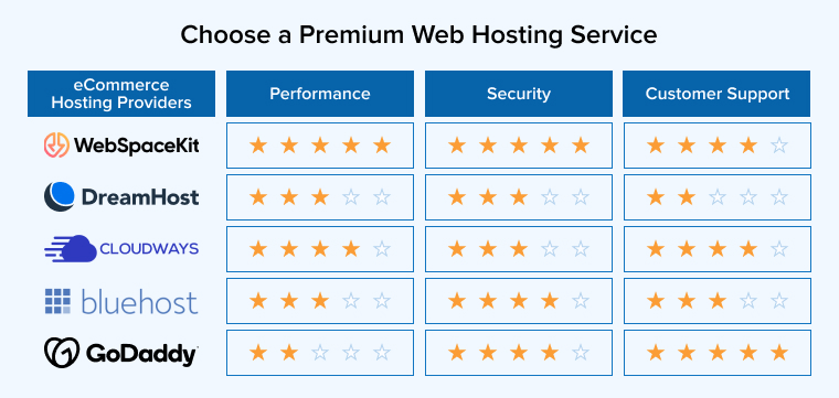
Slow eCommerce websites are less likely to rank well in Google, and even if they do, site visitors are more likely to leave if they have to wait for pages to load. One-quarter of users will leave a site that takes longer than 4 seconds for it to open, as reported by Loadstorm, Econsultancy.
Your site’s performance will suffer and you may experience other issues if your web host is untrustworthy. The success of an online shop depends on how quickly the e-commerce website loads. Fast website loading times are essential for high conversion rates. However, you’ll spend more money in the long run on a free or low-cost web host.
When web pages take too long to load, consumer satisfaction drops by 16% and conversion rates drop by 7%, according to studies. A two- or three-second lag on your eCommerce site is unacceptable.
Error messages, crashes, and delayed loading times are even more frustrating. Investing the funds in a high-quality web hosting package and the best e-commerce platforms will save you the trouble of battling these issues later.
1.2 Avoid Clutter
A web design that is easy to navigate and quickly locates the desired item is preferred by users. Don’t distract people from taking the intended actions by including unnecessary elements like flashy visuals, animations, or lengthy menus in your designs. Additionally, an effective website design helps you to convert visitors to consumer conversion.
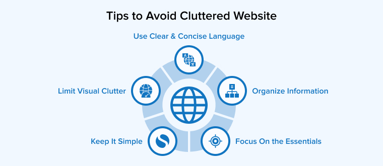
As a first step, you should clean up your website’s interface. Customers who absorb too much data during their visit to your shop may become confused. It’s a standard marketing tactic for online stores.
Make sure your top-selling items are prominently displayed, and that consumers can find out about promotions and advertising on the landing pages themselves. Make sure that your items are the main attraction.
1.3 Embrace Design Thinking
The first impression you make on users is the most crucial. In the competitive world of online retail, how you initially come across to a potential consumer is key.
Using “design thinking,” creators create products and services by imagining what the target audience values. Doing so should yield a final product that is both saleable and user-friendly.
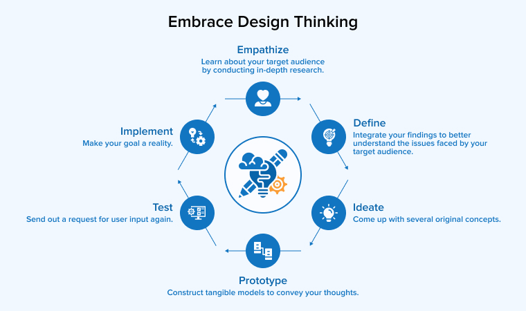
The four stages of design thinking are as follows:
- Consider the customer’s perspective: Take the user’s perspective and use questionnaires, surveys, and statistics to learn more about their needs.
- Customers’ issues must be defined: Focus on a single issue raised in the preceding phase.
- Bring a solution: Put the answer into action by creating the product.
- Test and evaluate: Apply the solution to a test, such as an A/B test.
Create a positive first impression with a beautiful design for your online store. First, you need to pick a design philosophy, such as minimalism, maximalism, or the latest eCommerce trend.
Then, make an impact with your company’s colors, unique graphics, clean images, relevant and accurate language, and so on. This is your chance to introduce your business to the Internet world and build brand recognition and awareness.
The next step is to check how your eCommerce site appears on various screen sizes. Too often, company owners skip testing their sites on mobile devices. This leads to a subpar mobile user experience. As a result, sales may suffer.
Last but not least, get your site optimized. Make sure your pages load quickly, that links don’t go dead, and that everything readers need to know is easily found. You should also use an SEO writing approach to make sure your material is accessible via search engines.
1.4 Make Your Ecommerce Website User-Friendly and Accessible
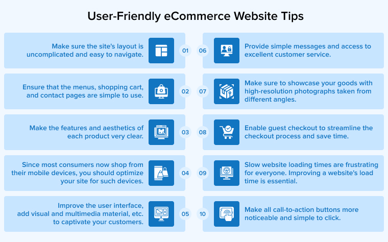
Displaying the primary menu on the eCommerce home page and each page of your eCommerce website will make it much more user-friendly. Also, make the menu as minimal as possible; no one likes wading through too many options.
Enhancing the search feature to increase conversions is at the heart of personalization. When a registered user conducts a search on your eCommerce site, they should get relevant, tailored results that is, items they are more likely to buy.
Personalization is a powerful tool for boosting user satisfaction and increasing sales. According to BigCommerce, conversion rates may be improved by as much as 20-30% with personalization. According to the McKinsey survey, just 15% of retailers have integrated customization across channels, despite the fact that 100% of the top quartile merchants rank it among their top 5 priorities.
Data is essential for all decisions you make. As long as privacy regulations are followed, the more information you can get, the better. Once gathered, data is utilized to tailor responses to each user’s preferences. This might be as basic as the buyer’s preferred clothes size, gender, or geographical area, or it can be more complex.
Finally, each web page should only include one or two calls to action. When there are too many options, users feel overwhelmed and abandon the page.
Admin dashboard layouts may help you gauge your site’s usability and friendliness and give you greater command over it in general. Admin dashboards are useful because they provide a bird’s-eye perspective of the site’s activity and facilitate the rapid creation of new pages.
1.5 Work On Improving Loading Times
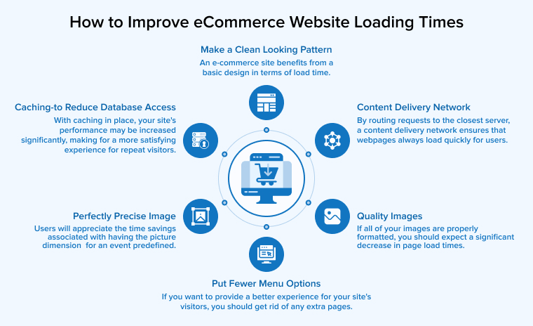
KissMetrics reports that over half of all customers have a two-second threshold for when a website should be usable. A 7% drop in conversion rate is possible from even a 1-second wait. Losing $2.5 million in yearly sales has the potential to cost a website making $100,000 per day in revenue.
You know how annoying it is when a page on an eCommerce website you want to see takes forever to load. If your website is sluggish to load, your viewers will likely feel the same way. However, you can improve loading times and add additional sales revenue to your ecommerce store by considering the following factors:
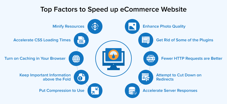
- Fewer HTTP requests are better.
- Accelerate server responses.
- Put compression to use.
- Turn on caching in your browser.
- Minify resources.
- Enhance photo quality.
- Accelerate CSS loading times.
- Keep important information above the fold.
- Get rid of some of the plugins.
- Attempt to cut down on redirects.
1.6 Showcase Your Products With Stunning Visuals

Since internet shoppers can’t hold or handle things before buying, high-quality images are the next best thing. Excellent images capture the eye, inspire confidence, and encourage a purchase.
67% of online customers say the photographs of any product are more important than customer evaluations or product descriptions, as stated by content marketing influencer and social media consultant Jeff Bullas. Choose the most alluring high-quality photos to get the attention of your customers.
Stick to your own aesthetic and create the material yourself rather than using stock photos to get the greatest results. Customers can’t “touch and feel” your products, therefore good product photos let them envision themselves with it. It’s a huge boon to your conversion rate. It’s one of the most recommended standards for online stores.
In addition, make sure you snap pictures of your eCommerce products from different perspectives so customers can make an educated purchase. Buyers will be put off by the lack of effort seen in a few photos.
1.7 Offer a Range of Filters
4/6 🔍 Seamless Navigation: ASOS gets it. Their easy-to-navigate site and handy filters make finding that perfect dress a breeze. In the world of ecommerce, speed is king. pic.twitter.com/E840e0tcYd
— Vincent Younan (@Vincent_Younan) May 17, 2023
There are shoppers that head straight to your e-commerce site because they know exactly what they’re looking for. But the other half of the buyers don’t understand a thing. Think of it as virtual window shopping. They’re curious to see your capabilities. and that’s why it’s crucial to have product filters.
Use product filters to help your customers easily find the products they’re looking for. 42% of online retailers don’t employ category-specific filters, even for their most popular items, claims Smashing Magazine. Consider your target audience while developing custom filtering options.
1.8 Don’t Force Shoppers to Create an Account
Providing a guest checkout option rather than a complicated checkout process is one of the best practices in online retail. Don’t make a customer sign up for an account if they don’t want to. There will be a dramatic increase in the number of shoppers who leave their purchases in progress. Simply collect email addresses for future communication and use them to confirm online purchases with customers.
1.9 Focus On Mobile Devices
Increased conversion rates may be seen on both mobile and desktop sites thanks to search engine optimization. Having a mobile-specific version of your site with a search that is optimized for small screens is a smart move toward customer satisfaction.
Shoppers can only see up to two items at a time on a mobile device. In contrast, with a laptop, you may see dozens of items at once. Users drop their interest in mobile purchasing very soon. A sale can be lost in this way.
Making the search bar accessible by default, however, can increase conversions and shorten the time it takes to complete a transaction.
When contrasted with “hierarchy style and pull-down refinement style navigation systems,” faceted search can enhance conversion rates by 20%. Improved conversion rates may be attained with the implementation of better filters using elements, a faster interface, and a well-optimized search.
1.10 Maximize Shopping Comfort
Give priority to simplifying the purchasing process for your customers. Even if a customer doesn’t have an account, they should still be able to place an order for a product. In this case, having:
- Every product page on your E-commerce website must include a buy button.
- The online store’s cart symbol is prominently displayed in the site’s navigation bar.
- An expedited checkout option that takes you directly to a streamlined checkout with all available payment and shipping options shown in one convenient location.
- You can also offer free shipping costs over a certain amount of purchases done by users.
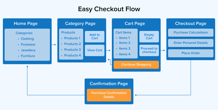
Request only essential information to execute an order. A study by the Baymard Institute found that 70 out of every 100 potential buyers dropped out before making a purchase.
1.11 Send Shopping Cart Abandonment Emails

Those who abandoned their carts while shopping with you likely did so for a specific purpose. Sending such people follow-up emails helps you stay in their minds.
Inquire as to the reason for the cart abandonment and provide a discount to encourage the customer to finish shopping. It’s one of the most disregarded yet potentially lucrative e-commerce best practices.
1.12 Providing Different Payment Options

You shouldn’t presume that everybody has a credit card. Even if they do, it doesn’t always signify that it’s their first choice of payment. It’s possible that they’ve reached the limit on one of the cards, or that another card offers higher perks as a member.
You should still accept cards from firms like Discover and American Express even if they have higher merchant transaction costs.
Your online store must also offer UPI options such as PayPal, GooglePay, and Apple Pay among other payment alternatives.
1.13 Include Customer Reviews and Testimonials On Product and Other Website Pages
Emphasis on positive customer feedback is a great way to give confidence to your business since no one can better describe the positive aspects of your products than the buyers who are actually using them. After clients have had a chance to use the product they have purchased, contact them again and ask for feedback.
Highlight positive customer feedback and reviews on product pages and elsewhere on the eCommerce website. Semrush found that 64% of marketers believe word-of-mouth to be the most effective method of advertising; nevertheless, it is ultimately up to you to make the most of this fact.
2. Conclusion
Although there are many additional eCommerce best practices that business owners should think about. However, even if you only use the aforementioned guidelines, your online store will start seeing lucrative results.
Keep an eye on your conversion rates and make adjustments as needed. Keep in mind that what succeeds for one company might not work for you too. As a result, ease out. If you stay true to what makes your company special, you’ll earn the devotion of the customers you serve.




Comments
Leave a message...