
Hiring Vuejs development services has been a common choice among businesses when it comes to developing progressive web app/s and high-performing desktop applications. Vue.js is a popular front-end progressive JavaScript framework for breaking down a website page into several pieces. You can customize the appearance and performance of your Vue.js projects with a variety of UI modules. These libraries offer a selection of pre-made, editable user interface elements.
The purpose of this post is to highlight some of the best Vue component libraries.
1. List of Best Vue Component Libraries
Here are list of Vue Component Libraries are
1.1 Vue Material
Vue Material Kit is used to speed up your design/development process. This is used especially when building new sites or web apps. Having a basic knowledge of JavaScript, Vuejs, and Vue Router is pretty much compulsory. Vue Material kit is also supportable on almost all modern web browsers. It also has an easy-to-use composition API which makes these different components development-friendly as well. Vue Material is also considered more special because it is created precisely according to Google material design specs.
Features :
- All current web browsers are supported.
- Flexibility in design and components that can be added as needed.
- Easy to carry and operate.
- Adaptable elements that work with any display size.
Installation
// Using NPM npm install vue-material –save // Using Yarn yarn add vue-material |
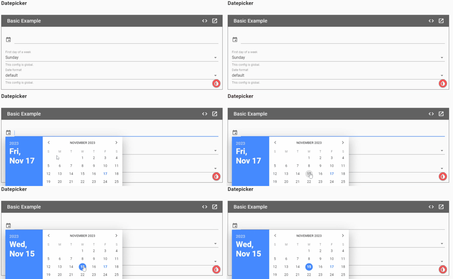
Here is the Demo Example of Datepicker Component of Vue Material
Demo Code :
import Vue from 'vue' import VueMaterial from 'vue-material' import 'vue-material/dist/vue-material.min.css' import 'vue-material/dist/theme/default.css' Vue.use(VueMaterial) <template> <div> <md-datepicker v-model="selectedDate" /> <md-field> <label for="movie">First day of a week</label> <md-select v-model="firstDayOfAWeek"> <md-option value="0">Sunday</md-option> <md-option value="1">Monday</md-option> </md-select> <span class="md-helper-text">This config is global.</span> </md-field> <md-field> <label for="movie">Date format</label> <md-select v-model="dateFormat"> <md-option value="yyyy-MM-dd">default</md-option> <md-option value="yyyy/MM/dd">yyyy/MM/dd</md-option> <md-option value="dd/MM/yyyy">dd/MM/yyyy</md-option> <md-option value="MM/dd/yyyy">MM/dd/yyyy</md-option> </md-select> <span class="md-helper-text">This config is global.</span> </md-field> </div> </template> <script> export default { name: 'BasicDatepicker', data() { selectedDate: null }, computed: { firstDayOfAWeek: { get () { return this.$material.locale.firstDayOfAWeek }, set (val) { this.$material.locale.firstDayOfAWeek = val } }, dateFormat: { get () { return this.$material.locale.dateFormat }, set (val) { this.$material.locale.dateFormat = val } } } } </script> |
Live Demo :
1.2 Vux
Another interesting UI component library that offers Mobile UI Components based on Vue & WeUI (the folks behind WeChat). The library also supports a WebPack + Vue-Loader + Vux workflow.
VUX originated from China and has significant documentation in Chinese with minimal English translation. VUX is one of the leading Vue UI component libraries that focuses well on the quick development of mobile components for your Vue application. Now in case, if you are considering building mobile apps then this one acts as a great help!
Features :
- With Vux, anyone can freely play around other components and libraries.
- Personalized theme settings are available.
- Great support available globally.
Installation :
// Using NPM
npm install vux |
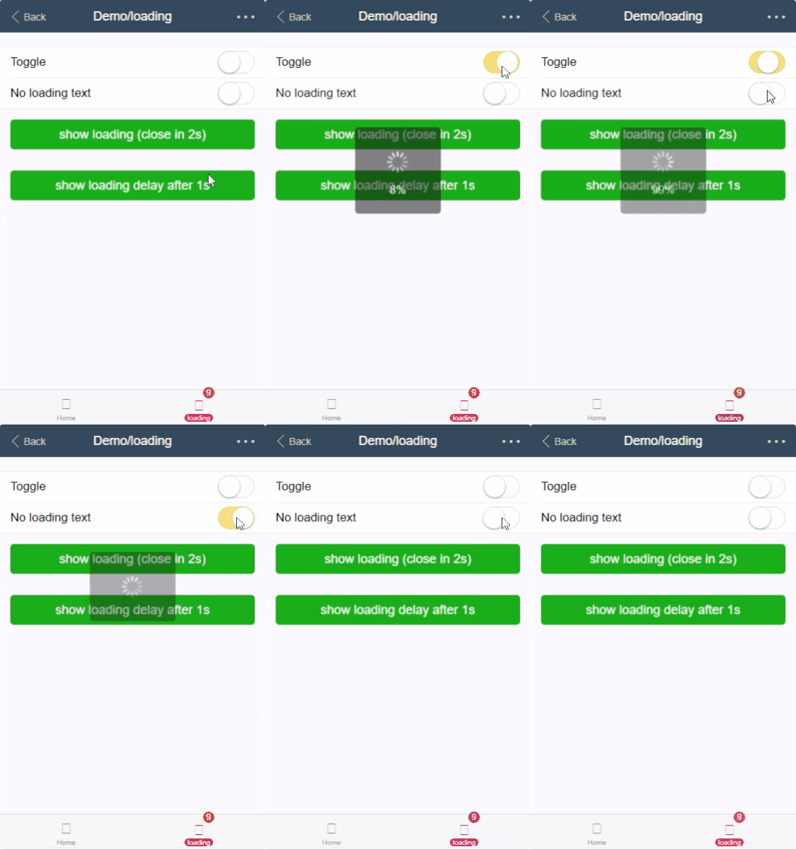
Here is the Demo Example of Loading Component of Vux
Demo Code :
import Vue from 'vue' import { Loading } from 'vux' Vue.component('loading', Loading) |
Live Demo :
1.3 iView UI
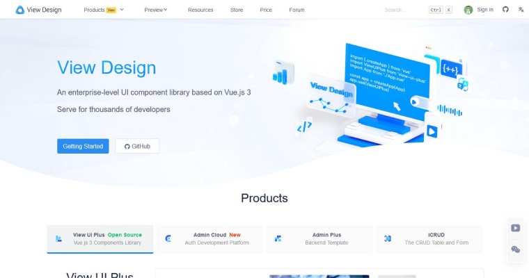
Another interesting Vue UI component library is iView. This Vue UI library is a high-quality user interface tool kit that is mainly built on Vue.js 2.0. With dozens of Vue UI components, Iview has been praised by companies like Alibaba, TalkingData, Lenovo, etc. Some of the astonishing features of this Vue UI library include a high-quality user interface with minimal code, a designated CLI visual tool for scaffolding. In addition to this, the iView Admin template can assist well in working with the Vue framework.
Features :
- Highly effective command line interface.
- Comprehensive information available over documentation.
- An intuitive API with consistent upgrades.
Installation :
// Using NPM npm install iview //Using Yarn yarn add iview |
Here is the Demo Example of Carousel Component of iView
Demo Code :
<template> <Carousel v-model="value" loop> <CarouselItem> <div class="demo-carousel">1</div> </CarouselItem> <CarouselItem> <div class="demo-carousel">2</div> </CarouselItem> <CarouselItem> <div class="demo-carousel">3</div> </CarouselItem> <CarouselItem> <div class="demo-carousel">4</div> </CarouselItem> </Carousel> </template> <script> export default { data () { return { value: 0 } } } </script> |
Live Demo :

1.4 Vue Material Kit
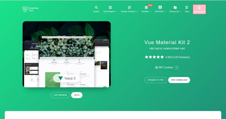
Another widely used name among the best Vue UI Component libraries includes Vue Material. Now, what’s so interesting about this lightweight library? Vue Material library is not as opinionated as other frameworks. This probably means, to create desktop apps fewer design choices must be considered
Also, you can begin with your Vue project right on by using its fully-featured advanced SPA boilerplate template based on Webpack. If you are looking for something solid but lightweight UI components which are also easy to use, just go for this one. Vue Material Kit also has 50+ handmade components, 2 customized plugins and much more.
Features :
- Has a sleek and contemporary appearance that is in line with Google’s Material Design specifications.
- Several pre-made elements that are used for quick construction, including buttons, cards, sliders, menus, and more.
- Checks that all parts work properly on mobile devices and can adjust to various screen sizes.
- Permits simple alteration of fonts, colors, and other design aspects to conform to app branding.
Installation :
# Using npm npm install vue # Using yarn yarn add vue |
Here is the Demo Example of Button Component of Vue Material Kit
Demo Code :
<script setup> // Vue Material Kit 2 component import MaterialButton from "@/components/MaterialButton.vue"; </script> <template> <MaterialButton>Default</MaterialButton> </template> |
Live Demo :

1.5 Mint UI
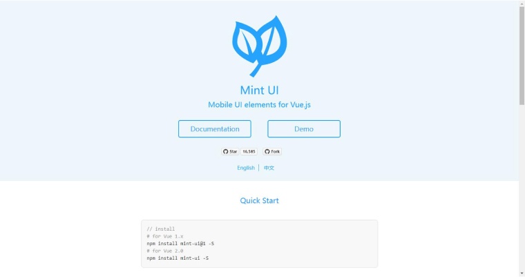
Are you looking for a library featuring mobile UI elements that are absolutely based on Vue? Well Mint UI is the name to take into account here! These kinds of Vue component libraries enable programmers to build mobile applications using familiar front-end framework codes. Also, it is possible to develop aesthetically magnificent mobile apps.
Mint UI is specifically developed according to Material Design specifications, each component is built with a mobile-first approach that has to be both responsive and modular. It provides a CSS framework and the size of the package is around 30 kb which makes it easy to use for mobile applications. Such Vue UI component libraries include Toast, Indicator, Infinite scroll, Message box, Action sheet, pop-up, and a lot more. The CSS components include Header, Tabber, Navbar, Buttons, Cell, Cell swipe, spinner, and so on. One more fact to know about Mint UI is that it is based on the Babel JavaScript compiler.
Features :
- Implementing on-demand loading lets you load styles whenever they are required.
- The size of the compressed package is around 30 kilobytes.
- CSS and JavaScript are used to create components that are compatible with mobile devices.
- CSS3 is utilized to manage animations in order to prevent problems on mobile devices.
Installation :
Here is the Demo Example of Popup Component of Mint UI
Demo Code :
Sync visible with one of your vue instance variables. Toggle it to switch on/off the popup. <mt-popup v-model="popupVisible" position="bottom"> ... </mt-popup> If the position attribute is omitted, the popup will be located at the center of the viewport (and of course you can relocate it using CSS). In this case, you may want to set its popup-transition attribute to popup-fade so that it'll have a fading effect when switched on/off. <mt-popup v-model="popupVisible" popup-transition="popup-fade"> ... </mt-popup> |
Live Demo :

1.6 Keen UI
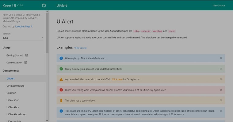
Another lightweight Vue.js element UI library to consider is Keen UI. Keen UI is not a CSS framework. This means it doesn’t include styles for a grid system, typography, etc. Here you will find 30 reusable components and all these components are customizable.
Features :
- Pays close attention to accessibility standards, taking best practices into account to make components useful for people with limitations.
- Helps developers get up to speed quickly with detailed documentation that includes examples, recommendations, and API references.
- Ensures important functionality without adding extra load to your program by emphasizing lightweight design.
Installation :
Here is the Demo Example of Collapsible Component of Keen UI
Demo Code :
<div class="page__demo"> <ui-collapsible title="This is open initially" open> Lorem ipsum dolor sit amet, consectetur adipisicing elit. Consectetur nemo suscipit ipsa molestias, tempora dolor natus modi et incidunt tenetur! </ui-collapsible> </div> <script> import UiCollapsible from 'src/UiCollapsible.vue'; export default { components: { UiCollapsible } }; </script> |
Live Demo :

1.7 VueTailwind
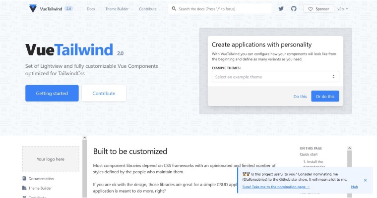
VueTailWind is a front-end library based on the popular Tailwind CSS framework. Although it is still under development. It is a popular javascript library that features a UI kit with pre-designed components. You can create an infinite number of variants for each use case by using this library and your design skills.
Features :
- Benefits from the vast ecosystem of Tailwind CSS plugins, extending its capabilities for additional features or design elements.
- Performance: Tailwind CSS’s approach to generating utility classes results in smaller file sizes compared to traditional CSS frameworks, contributing to better performance.
Installation :
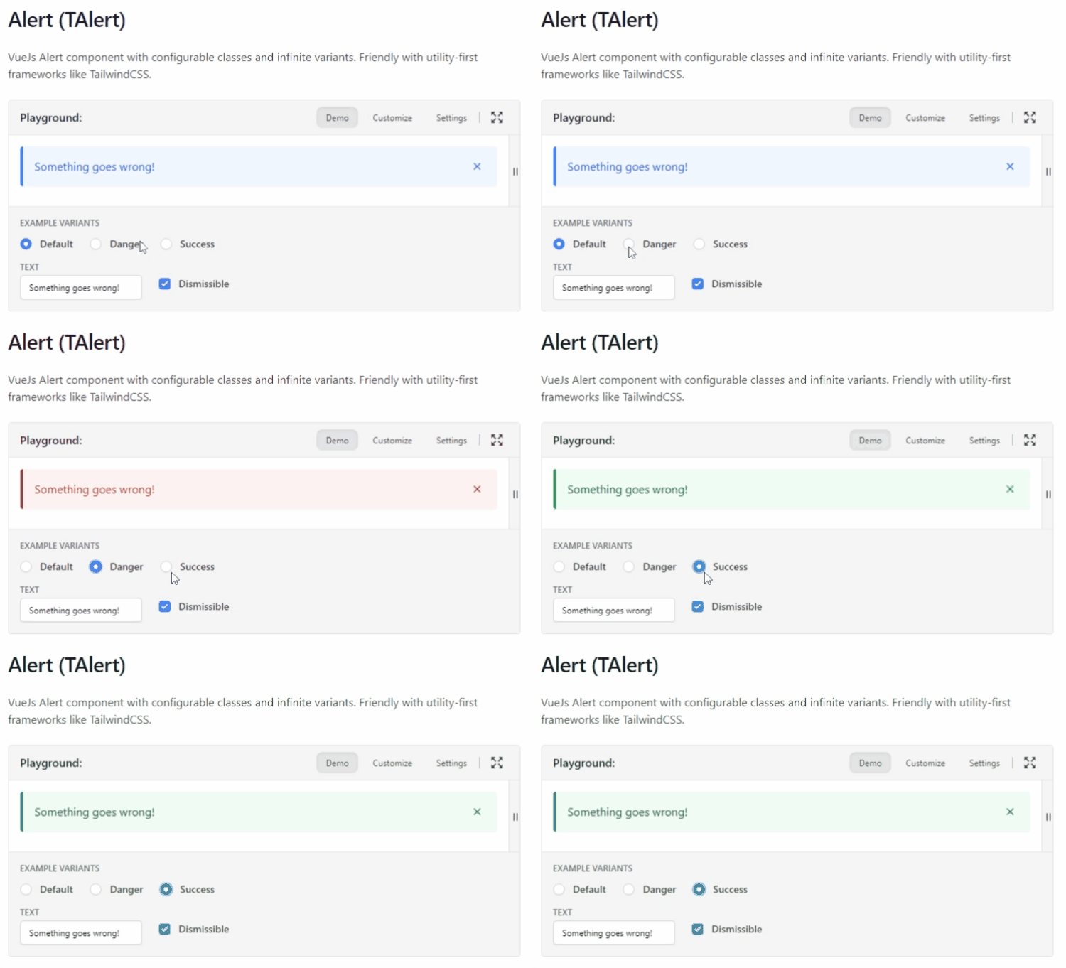
Here is the Demo Example of Alert Component of Vue Tailwind
Demo Code :
<t-alert variant="error" show> Something goes wrong </t-alert> { fixedClasses: { wrapper: 'relative flex items-center p-4 border-l-4 rounded shadow-sm', body: 'flex-grow', close: 'absolute relative flex items-center justify-center ml-4 flex-shrink-0 w-6 h-6 transition duration-100 ease-in-out rounded focus:ring-2 focus:ring-blue-500 focus:outline-none focus:ring-opacity-50', closeIcon: 'fill-current h-4 w-4' }, classes: { wrapper: 'bg-blue-50 border-blue-500', body: 'text-blue-700', close: 'text-blue-500 hover:bg-blue-200' }, variants: { danger: { wrapper: 'bg-red-50 border-red-500', body: 'text-red-700', close: 'text-red-500 hover:bg-red-200' }, success: { wrapper: 'bg-green-50 border-green-500', body: 'text-green-700', close: 'text-green-500 hover:bg-green-200' } } } |
Live Demo :
1.8 Prime Vue
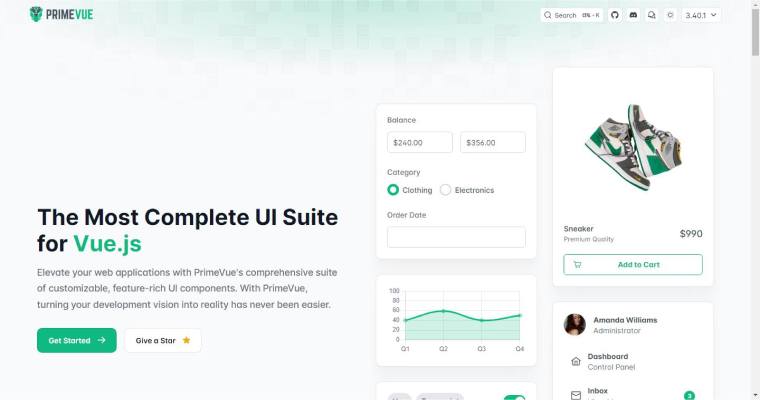
The next one in this component queue of exceptional components libraries of vue is a popular name called PrimeVue comp. Vue has been used by many giants like Airbus, Intel, and others to rely on the Prime Vue component library. This type of component sets out as an excellent example of a framework that allows you to create unique, complex, modern, and extremely dynamic Vue applications. They include a variety of components which would help you to develop from tables to well-designed graph-based organization charts. Prime Vue can also be used to develop interactive Vue applications.
This js framework can also be used to create user interfaces for enterprise software because its components are designed for creating complicated software applications. Prime Vue is also popular among all types of businesses.
Features :
- Designed to meet the requirements of the Web Content Accessibility Guidelines.
- Exceptional assistance with adaptive layout, powered by components.
- Pick one of several pre-made themes or use the CSS library that best suits your needs to develop your design systems.
- A one-business-day response time and the ability to suggest library improvements and new features are hallmarks of the outstanding support service.
Installation :
# Using npm npm install primevue # Using yarn yarn add primevue # Using pnpm pnpm add primevue |
Here is the Demo Example of Select Button Component of Prime Vue
Demo Code :
<template> <div class="card flex justify-content-center"> <CascadeSelect v-model="selectedCity" :options="countries" optionLabel="cname" optionGroupLabel="name" :optionGroupChildren="['states', 'cities']" style="min-width: 14rem" placeholder="Select a City" /> </div> </template> <script setup> import { ref } from "vue"; import CascadeSelect from 'primevue/cascadeselect'; const selectedCity = ref(); const countries = ref([ { name: 'Australia', code: 'AU', states: [ { name: 'New South Wales', cities: [ { cname: 'Sydney', code: 'A-SY' }, { cname: 'Newcastle', code: 'A-NE' }, { cname: 'Wollongong', code: 'A-WO' } ] }, { name: 'Queensland', cities: [ { cname: 'Brisbane', code: 'A-BR' }, { cname: 'Townsville', code: 'A-TO' } ] } ] }, { name: 'Canada', code: 'CA', states: [ { name: 'Quebec', cities: [ { cname: 'Montreal', code: 'C-MO' }, { cname: 'Quebec City', code: 'C-QU' } ] }, { name: 'Ontario', cities: [ { cname: 'Ottawa', code: 'C-OT' }, { cname: 'Toronto', code: 'C-TO' } ] } ] }, { name: 'United States', code: 'US', states: [ { name: 'California', cities: [ { cname: 'Los Angeles', code: 'US-LA' }, { cname: 'San Diego', code: 'US-SD' }, { cname: 'San Francisco', code: 'US-SF' } ] }, { name: 'Florida', cities: [ { cname: 'Jacksonville', code: 'US-JA' }, { cname: 'Miami', code: 'US-MI' }, { cname: 'Tampa', code: 'US-TA' }, { cname: 'Orlando', code: 'US-OR' } ] }, { name: 'Texas', cities: [ { cname: 'Austin', code: 'US-AU' }, { cname: 'Dallas', code: 'US-DA' }, { cname: 'Houston', code: 'US-HO' } ] } ] } ]); </script> |
Live Demo :

1.9 Quasar

This list will never be complete without Quasar. Yes, Quasar is one of the most popular, lightweight and active community-backed frameworks which is also popular among developers. This means Quasar has a huge community that supports developers in developing new-edge and technically sound applications. Quasar is popular for material design guidelines and it can be used in development of both desktop and mobile browsers. What makes Quasar special from others in the same league is its cross-platform support, it can also be used in making some out of the box or nifty based applications.
Developers choose Quasar because they get an option of accessing multiple platforms from one single code base and hence it saves a lot of time and effort. It has a large community on GitHub and there are many contributors too. One quality of Quasar that makes it unique is its “write once and deploy concurrently”, which makes users more inclined to use this as you get real-time outcomes.
Features :
- It is applicable for desktop, web, and mobile browsers.
- Enables building modes for SPA, SSR, PWA, mobile app, desktop app, and browser extension.
- Equipped with the ability to automatically eliminate dead code, making it possible to remove unused code.
- It can be simply modified and expanded.
- Frequently updated.
- This framework is designed with a strong emphasis on performance.
Installation :
// Using NPM npm install quasar // Using Yarn yarn add quasar |
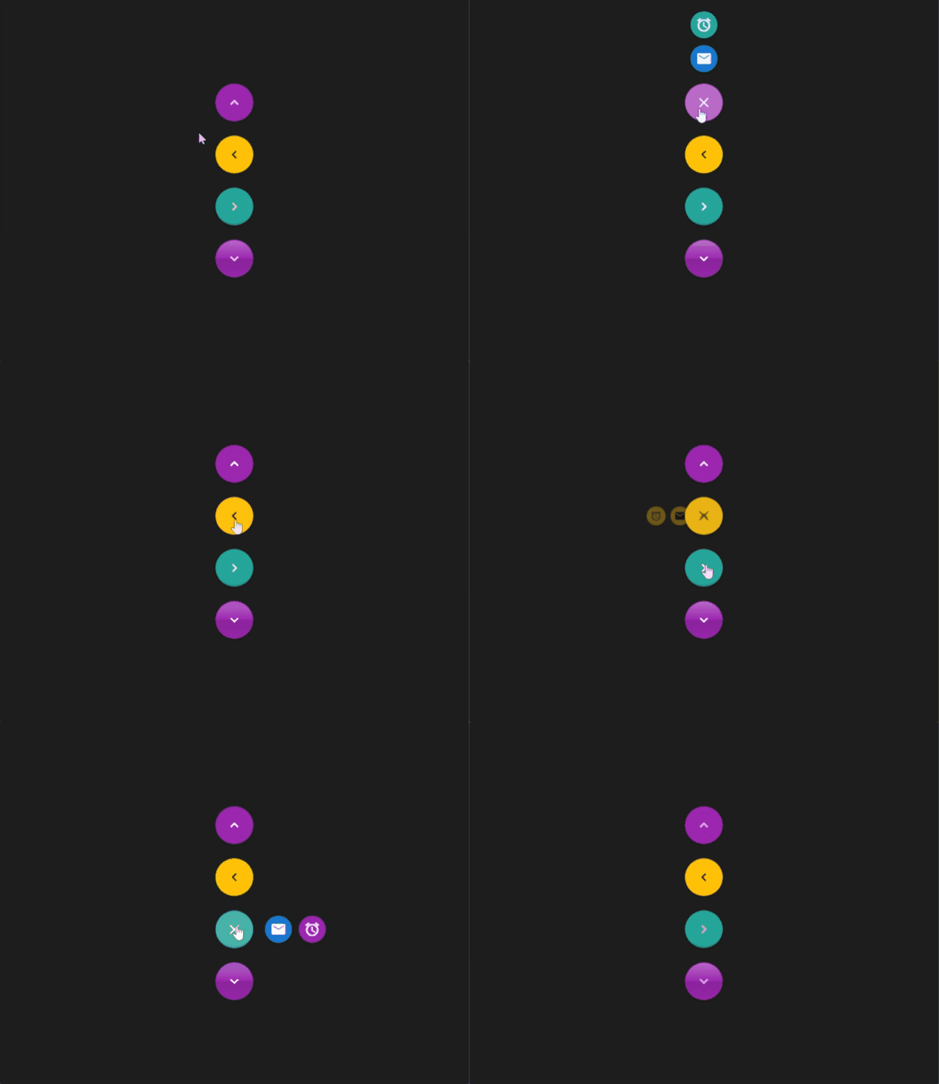
Here is the Demo Example of Button Component of Quasar
Demo Code :
<template> <div class="q-px-sm q-py-lg"> <div class="column items-center" style="margin-top: 100px; margin-bottom: 100px;"> <q-fab color="purple" icon="keyboard_arrow_up" direction="up"> <q-fab-action color="primary" @click="onClick" icon="mail" /> <q-fab-action color="secondary" @click="onClick" icon="alarm" /> </q-fab> <br> <q-fab color="amber" text-color="black" icon="keyboard_arrow_left" direction="left"> <q-fab-action color="amber" text-color="black" @click="onClick" icon="mail" /> <q-fab-action color="amber" text-color="black" @click="onClick" icon="alarm" /> </q-fab> <br> <q-fab color="secondary" push icon="keyboard_arrow_right" direction="right"> <q-fab-action color="primary" @click="onClick" icon="mail" /> <q-fab-action color="accent" @click="onClick" icon="alarm" /> </q-fab> <br> <q-fab color="accent" glossy icon="keyboard_arrow_down" direction="down"> <q-fab-action color="amber" text-color="black" @click="onClick" icon="mail" /> <q-fab-action color="amber" text-color="black" @click="onClick" icon="alarm" /> </q-fab> </div> </div> </template> <script> export default { setup () { return { onClick () { // console.log('Clicked on a fab action') } } } } </script> |
Live Demo :
1.10 Vuesax
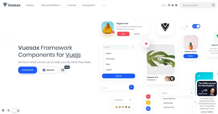
Vuesax contains visually appealing and well-designed components that you may incorporate into your own projects. When you use Vuesax, this framework will ensure exemplary development experience in which you are able to style the components depending on your branding as well as needs and thus keep up the pace of your vue development project and its quality.
Within this, you may find many of the top front-end development tools such as Sass, Typescript, and others too are supported and integrated. Despite the fact that Vuesax is not as frequently used as other Vue UI component libraries, it is independent of any prescriptive design language and it will set your Vue app apart from the crowd. You can use it for its one-of-a-kind design to offer your responsive web sites a distinguished appearance.
Features :
- This framework is lighter and uses less code since you can utilize all of the Vuesax components or only the ones you need when you need them.
- With Vuesax, you can build web apps fast since it does all the heavy lifting for you. All you have to do is add a component, and your project has its own working part.
- You can incorporate Vuesax and its components in your project without having a deep understanding of Vuejs or JavaScript. Vuesax offers unique features that other frameworks don’t offer, allowing us to develop innovative user experiences.
Installation :
npm install vuesax@next OR yarn add vuesax@next |
Here is the Demo Example of Pagination Component of Vuesax
Demo Code :
import Vue from 'vue' import { vs-pagination } from 'vuesax' import 'vuesax/dist/vuesax.css' Vue.use(vs-pagination) <template> <div class="center"> <vs-pagination v-model="page" :length="20" /> </div> </template> |
Live Demo :

1.11 Buefy
Choosing Buefy will only be worth it if you want to combine Bulma with Vue. The results will be outstanding and allow you to create visually appealing applications with minimal code. Despite the fact that the default version has a distinct appearance and feel, also this framework is very adaptable.
When you use Buefy, you can use Sass to customize all the global variables that will be used throughout the application. Buefy also provides you the power to add dynamic components to show interactivity. Like you can add status bars, tables or even infographics, charts or anything else. Buefy makes it an excellent choice for highly user-friendly online applications. When you use Buefy, you are free to do anything with your own brands, colors, sizing constraints, and more. Buefy is definitely making adjustments simple and easy.
Features :
- The integration of Bulma with Vue allows for the building of visually appealing applications with little coding requirements.
- Although the framework has a unique and noticeable style and texture by default, it is highly versatile.
- Customizations may be efficiently and easily executed. You have the ability to establish your brand’s color scheme, standards for size, and further specifications.
- Buefy employs Sass to modify global variables.
- This software is lightweight and does not require any other software components.
Installation :
npm install buefy |
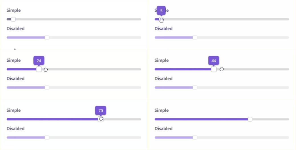
Here is the Demo Example of Slider Component of Buefy
Demo Code :
<template> <section> <b-field label="Simple"> <b-slider v-model="value"></b-slider> </b-field> <b-field label="Disabled"> <b-slider :value="30" disabled></b-slider> </b-field> </section> </template> <script> export default { data() { return { value: 5 } } } </script> |
Live Demo :
1.12 Element
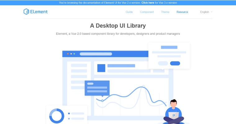
The last one in this list is Element which is a well-known Vue UI component library. To elaborate more about Element, then it is a web-based UI component framework that also has React and Angular versions other than Vue. Because of lack of responsiveness, these component libraries are mostly aimed to work well for desktop applications.
As it is designed for desktop user interfaces, you can freely enable responsive features that help you easily develop grids, tables, components based on window size and also hiding components. One more thing that needs to be noted is that Element allows you to customize your theme and preview it in real time with the help of a Chrome extension. Since elements are developed in China, the documents and all are written in Chinese language. So, it’s highly recommended to use the right translated versions (Spanish and English translations are available) of instructions before starting a project. Otherwise Element is extremely helpful and a fantastic tool for teams of engineers, designers, and product managers to use when creating sophisticated desktop user interfaces.
Features :
- It was originally composed using TypeScript.
- Offers pre-installed transitions.
- Provides translations for over 30 languages.
- Includes a feature that enables a dark mode.
- The level of customization is extensive with the utilization of SCSS variables.
Installation :
npm i element-ui -S |
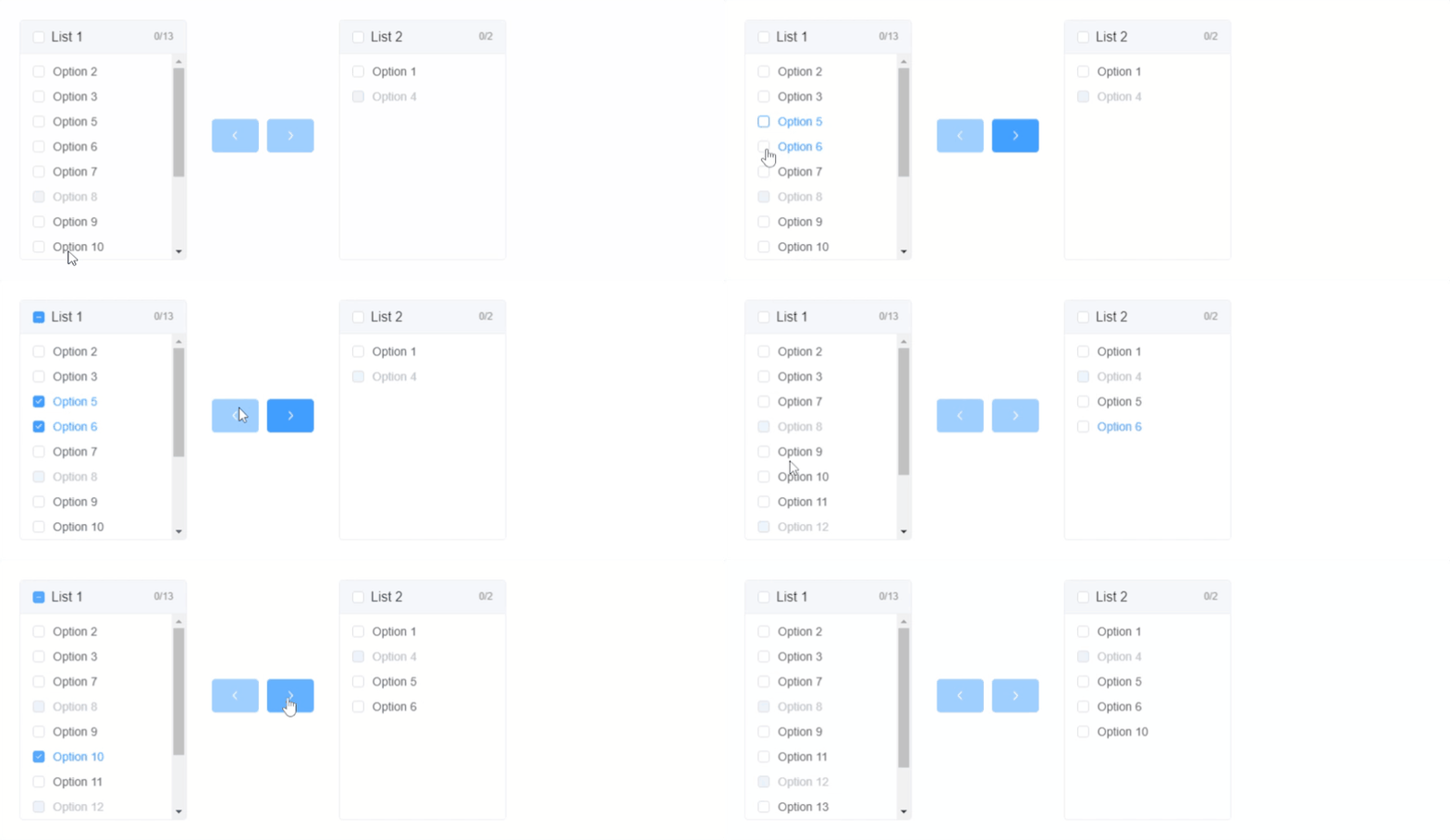
Here is the Demo Example of List Option Component of Element
Demo Code :
@import url("//unpkg.com/[email protected]/lib/theme-chalk/index.css"); var Main = { data() { const generateData = _ => { const data = []; for (let i = 1; i <= 15; i++) { data.push({ key: i, label: `Option ${ i }`, disabled: i % 4 === 0 }); } return data; }; return { data: generateData(), value: [1, 4] }; } }; var Ctor = Vue.extend(Main) new Ctor().$mount('#app') <script src="//unpkg.com/vue@2/dist/vue.js"></script> <script src="//unpkg.com/[email protected]/lib/index.js"></script> <div id="app"> <template> <el-transfer v-model="value" :data="data"> </el-transfer> </template> </div> |
Live Demo :
2. What is a Vue Component Library?
When a single element or a group of elements is successful in creating an entity it is called a component library. It can be built with anything whether its HTML elements or any other components. Now does that mean, a component is dependent on any framework? Of course, not. All you must be having is some sort of logic that has the ability to change its style or behave indifferently. By having UI component libraries that are highly based on React or Vue, interactions and conducting collaborations become way easier. Utilizing Vue components is only possible when you are working in a Vue application. As an output, you will always receive HTML, CSS, and JavaScript in the end.
When speaking about component libraries, it is quite evitable for you to think of a large project featuring a wide range of developers and designers. The main objective of Vue CLI here is to set design standards and principles. But, do you think that the component library is based on the size of the application? A Vue CLI (component library) is a set of reusable js components. Here you have elements, through which you can easily customize the theme as well as preview it in real-time.
Whether it’s a folder featuring common components used throughout the application. Now there are two choices either to use as a distributed package on npm or to make a crucial aspect of the bigger design system. However a component library can be small as well as large. The actual definition of a component library is that it keeps on fluctuating depending on your project needs. You can create a component all by yourself or fortunately you will come across a plethora of public component libraries for your vue apps.
2.1 When to use a Component Library?
Let’s assume a situation where you have to use similar components at two or more different places. Most Vue developers tend to create a general component and place it inside a library folder. Then use that component in both places instead.
Another reason to use a component library is that you can simply see whether the component looks good or what it sounds like, irrespective of the material design purpose. Also, different public libraries can be used featuring ready-made designs and tested components.
3. Benefits of using UI Components
There has been a lot of buzz going for reasons to choose Vue framework for your development project or creating a component library. Well, one of the obvious advantages is to reduce complexity and make web app development way easier for your team. Without much ado, let’s just take a look at certain advantages offered by a Vue component library.
3.1 Collaborate Efficiently
Developers working with Vue UI component libraries often have realized the fact that it provides a great aid when they collaborate with the design team. Apart from enhancing collaboration, the UI component library also improves frontend development to a great extent. For instance, if a designer requires to design a new bunch of components what he or she will do is, begin with simply checking the library and gathering all the necessary elements for creating a new Vue UI component.
In case, there is an element missing since they are new, all a designer or a developer requires to do is design new UI elements. After all this, you will find a new component. Now in such a scenario, what happens when frontend developers are able to integrate the library into their workflow. Simple, the process of implementation of user interfaces will automatically start as soon as the designer adds the component to the library.
3.2 Adaptability
Now most of the time when you take on a new project to build web applications, developers and designers often look for a custom look and feel in advance. So being a developer, what you need to take care of, is creating components and how it feels.
Most UI libraries provide high-end support for theme-ability. Changing the color palette there are also changes to how buttons, inputs, and checkboxes look. In your custom component library; if you want to create dynamic applications, it isn’t really a problem. Since you’re building right from the scratch there is no point in having an accurate account for any existing styling.
3.3 Consistency
Whether you are designing software or web pages of products with multiple designers, consistency is extremely important. Imagine you are writing a blog and suddenly some other writer starts editing it, of course, the consistency will get hindered.
3.4 Build Components in Isolation, to Make Them Reusable by Default
When building one of the components needed, adding CSS is pretty much mandatory. This must be in context with the design created for that page. After a while, a new design is created for a different page using the same components but slightly modified. And once all this is done the assignment will be passed on to your colleague who is bound to solve the task right in a similar manner.
However, the aforementioned example might seem far-fetched but nonetheless, do you think it’s entirely unrealistic? Well, imagine what if people don’t talk or don’t do regular Vue code reviews – what would be the scenario? Probably, it will become hard to know regarding all features and several other parts of the application.
This is when a Vue component library or Vue development tools come to the rescue. This enables developers to create a component in the Vue UI component library, you may find yourself being isolated initially. When this happens just make sure that it is reusable right from the beginning since web developers are forced to work outside of a certain page context.
Also, ensure the overall visibility so that things don’t get repeated unnecessarily. But that doesn’t mean you ignore the reusability point of the component. This saves time and money. Having one place for all components can definitely act as bliss as the process becomes way simpler, better, and makes it easier.
3.5 Maintenance
Last but not the least comes maintenance, since you have all components in one place it makes it way easier to maintain. Pushing updates, especially the ones with new features can be implemented at a lightning speed. Everyone working on the development of any web application gets a quick overview of the ongoing projects if it is at one place.
4. Conclusion
Towards the end of this blog, we can conclude that Vue and its component libraries, tools and editors are capable of covering almost everything that you need for your business application. Our tried and tested approach with Vue components will help your business build customized and user-friendly applications easily. However, with this article, you’ll be able to pick a proper UI library for your next Vue.js project. If you are unable to locate a good Vue UI library, then you must partner with third-party companies that are only dedicated to your task and will provide you all the assistance by their expert team of Vue.js developers.




Comments
Leave a message...